A client came to me with a simple request. They run a chain of six restaurants and wanted all of them shown on one map on their website. Not a list of addresses. Not six separate embedded Google Maps, one per page. One map, all locations, matching their brand.
It sounds like a small thing. It turned out to be a good example of a problem a lot of businesses with more than one location run into, and most of them settle for something that doesn't quite fit. It's also a good example of something else: how much you can now build yourself with an AI, if you use it for more than writing text.
Where most people start
If you search for how to put multiple locations on a map, the answer you'll find almost everywhere is Google My Maps. Free, made by Google, technically does the job.
It also looks exactly like what it is: a free internal Google tool from over a decade ago that was never meant to be a design element on a modern website. The pins are generic. The info windows are cramped. There's no way to match your brand colours, your fonts, or your photography. It works, but it looks like something you bolted on rather than something you built.
The next step up is usually a paid map tool: Atlist, Storemapper, Mapize, and similar services. These are genuinely more capable. Custom pin colours, nicer popups, imports from a spreadsheet. But almost all of them charge either a flat monthly fee or, worse, a fee that scales with how much traffic your map gets. For a small business, paying a recurring bill for a map, a single element on a single page, starts to feel disproportionate. And even on the paid tier, you're usually working inside a template. You can change colours, not the actual structure of what the map looks like.
For a restaurant chain with a specific visual identity, gold accents, a particular font pairing, warm photography, neither option was going to feel like it belonged on the site.
What the result looks like
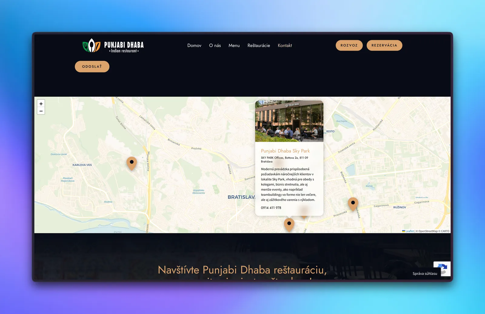
This is the map that ended up on the client's site. Five locations across Bratislava and one further out in Piešťany. When they're close together, the pins merge into a single rounded cluster showing the count, in the brand's gold colour, so the map doesn't look cluttered when zoomed out. Tap a pin and a card opens with a frosted-glass effect, matching the modern-but-warm feel of the rest of the site: a full photo of the restaurant, its name in the brand's accent colour, a clickable address that opens Google Maps directions, a short description of what makes that specific location worth visiting, and a tap-to-call phone number.
Nothing about it looks like a stock map plugin. It looks like a part of the website that was designed for it, because it was.
The finished site is in my portfolio: Punjabi Dhaba.
How I actually built it (mostly by prompting an AI)
Here's the part that might surprise you. I didn't hand-write most of this from scratch. I built the bulk of it by describing what I wanted to Claude, an AI assistant, and refining it prompt by prompt: "put these locations on a map, cluster the pins when they're close together, open a card with a photo and a call button when one is tapped, make it match these brand colours." The AI produced the working code. My job was knowing what to ask for, spotting what it got wrong, and fitting it into the real site.
The building blocks underneath are all free. The map runs on Leaflet, an open-source mapping library that quietly powers a huge number of tools you've used without realising it. A single free add-on handles the pin clustering. The map background, the streets and landmarks, comes from CartoDB's free tier, using their light "Voyager" style so the gold pins and the popup cards stand out instead of fighting a busy background.
Everything on top, the pin design, the cluster badge, the popup card, the fonts, the colours, was shaped to match the brand exactly. Not a template with the colours swapped out. Designed like any other part of the site.
The honest cost comparison: a paid map tool, even at a modest tier, runs somewhere between fifteen and fifty euros a month, sometimes tied to how many visitors see it. This has no recurring cost at all. It's part of the website, built once, and it stays that way.
The part that actually took the effort
Getting a map with pins on it working is not hard, and an AI will get you there fast. Getting it to look intentional, rather than bolted on, is where the real work is, and where you still have to steer.
A few specific things mattered:
The initial zoom and framing. With five locations clustered in one city and one considerably further away in another town, the map needs to frame itself sensibly so everything is visible without the view feeling awkward or leaving too much empty space at the edges.
Mobile behaviour. More people will see this on a phone than on a desktop. The popup card had to resize sensibly on a small screen, the map needed enough height to feel usable rather than cramped, and the scrolling had to be handled carefully so that swiping down the page doesn't get trapped by the map's own zoom.
Fitting into the existing page. The map lives inside a page built with the site's page builder, which comes with its own styling assumptions. Getting the custom pin sizes, the card padding, and the typography to render exactly as designed, rather than being quietly overridden by the site's defaults, took a few rounds of testing directly on the live layout rather than in isolation.
The clearest example was on my own iPhone: tapping a pin opened the card, then closed it again a split second later. The AI's first couple of fixes didn't hold. The real culprit was the clustering add-on quietly removing any pin that scrolled off-screen as the card panned into view, which dragged the popup down with it. There's no prompt that gets you past that without stopping to understand what's actually happening.
None of this is a feature you'd list in a pitch. It's the difference between a map that looks like it was made for the site and one that looks like it was dropped onto it. It's also where your time goes if you build it yourself: not on generating the map, but on fixing the last ten percent.
Is this the right approach for every business
Not necessarily. If you have two locations and just want visitors to find your address, an embedded Google Maps iframe is genuinely fine, there's no need to overbuild it. If you need hundreds of locations with search, filtering, and a store-locator style interface, a proper store-locator tool might well justify its subscription.
Where this approach earns its keep is the middle ground. A handful of locations, a business with an actual visual identity worth protecting, and a website meant to represent the brand properly rather than just list information. A restaurant chain, a clinic group, a chain of studios or showrooms. Anyone for whom "looks like every other business's map" is a real cost, not just an aesthetic complaint.
If you're weighing this for your own site
The questions worth asking yourself: does your business have more than one location and a brand you actually care about? Does your current solution, whether that's no map at all, a generic Google embed, or a paid tool, feel like it belongs on your site, or like a separate thing stitched on?
If it's the latter, you have two honest options. If you're happy to get your hands dirty, you can build a version of this yourself. You're very likely already paying for an AI subscription, and this is exactly the kind of thing it's good for, well beyond writing copy. I've put together a step-by-step guide with the actual code so you can follow along.
Or, if you'd rather not spend the evenings on it, I do this kind of work as part of web development projects, and the contact page is the fastest way to reach me.
Either way, the point stands: a custom map that fits your brand no longer has to mean a monthly bill.
Frequently asked questions
Do I have to pay monthly for a map with multiple locations?
No. Paid map tools charge €15-50 a month, often scaling with traffic, but a custom map built on free libraries like Leaflet has no recurring cost. You pay once for the setup, and it stays part of your site.
Can I really build something like this myself with AI?
A fair bit of it, yes. If you're reasonably comfortable with your own site, an AI like Claude can generate most of a working map from plain-language instructions. The catch is the last stretch: matching your brand and getting it right on mobile still takes some hands-on fixing.
What's actually wrong with Google My Maps?
Nothing, if you only need a functional map. But it looks like the free, decade-old internal tool it is: generic pins, cramped info boxes, no way to match your brand's colours or fonts. On a site meant to represent your business, it stands out as bolted on.
When is a paid store-locator tool actually worth it?
When you have a lot of locations, dozens or hundreds, and need search, filtering, and a proper store-locator interface. At that scale the subscription earns its keep. For a handful of locations, it's usually overkill.
Will a custom map slow down my website?
Not if it's built with care. Leaflet is lightweight, the map tiles load only as needed, and the whole thing can be kept lean. Done right, it adds a polished feature without a noticeable hit to load speed.